Meal Management and Cooking Mobile App
An application that helps users manage their meals and master in cooking
UX Case Study and UI Design
Overview
These days, young people always try to find different ways to cook their meals. Many of them have just started cooking and want to improve their cooking skills while others cook frequently in their lives and wish to learn different cooking styles. In this case study, we aimed to address the young generation’s needs for different types of food categories and to provide more flexible ways for them in learning cooking through step-by-step recipe instructions by designing new app interfaces - Eatsy.
01
Define
User Profiles
The younger generation who have just started learning to cook and want to improve their cooking skills, and those that wish to pick up different cooking styles and techniques.
Role
User reseracher, UI designer
Goal
02
ResearchCultural Probe
Our target participants for the research are college students as they represent the population of novice cooks. Since college students do not have a regular cooking schedule, our team determined that it would be appropriate to use cultural probe as the research method. Cultural probe allowed us to understand the participants' context without being on the site.To comply with safety precautions of COVID-19, our team decided to use virtual diaries that allowed users to submit their thoughts and cooking experience after each cooking session along with photos of their cooking process. After collecting data of cultural Probe from our participants, we conducted follow-up in-depth interviews with our participants.
Data collection and analysis
Affinity Diagram
After collecting the data from our participants, we conducted an affinity diagramming session to discover common patterns that our participants experienced during their cooking sessions.
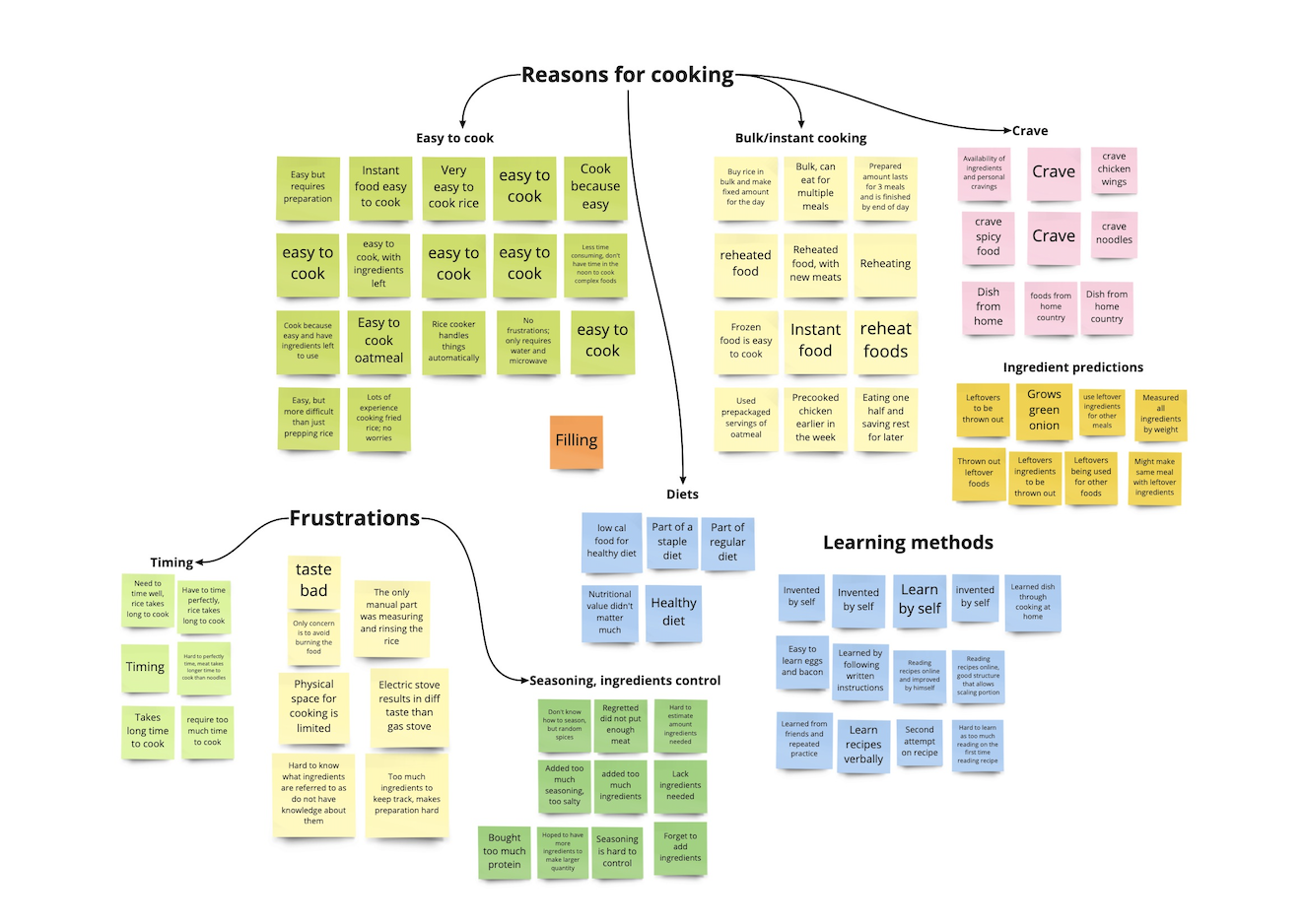
Work Models
We created work models from the data, categories, and themes we gathered and analyzed from affinity diagrams.
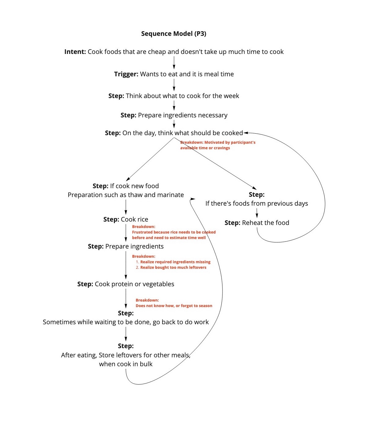
Sequence Model
We created a sequence model to identify at which stage of the cooking process did the participants experience frustrations.
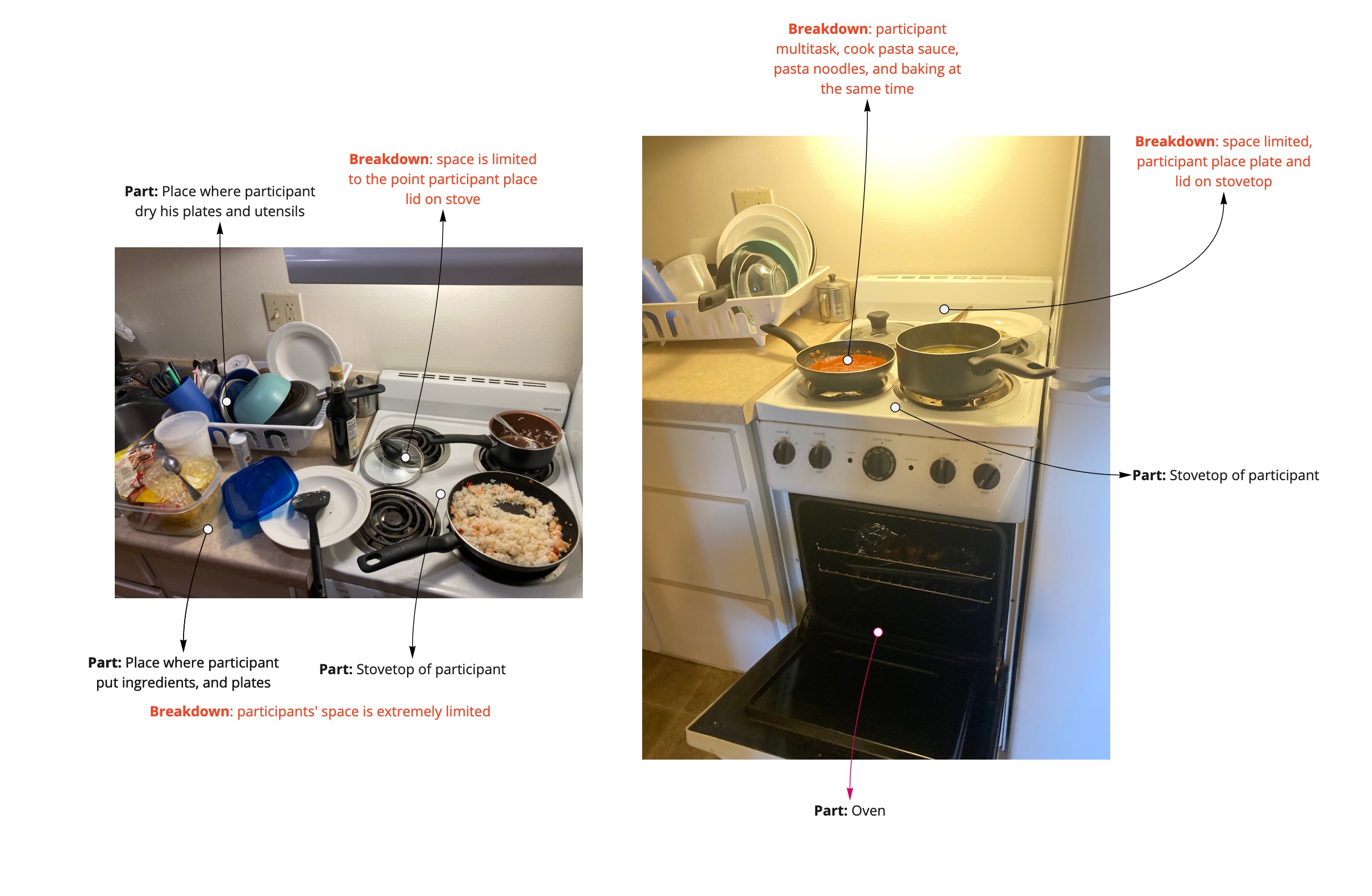
Artifact Model
We also built a artifact model to understand how the participants interact with physical artifact in the kitchen.
Key Findings
03
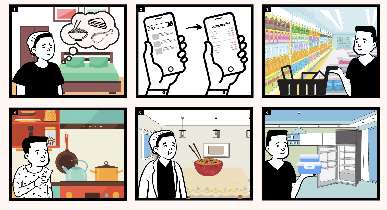
IdeationStory Board
We started by storyboarding a hypothetical use case of the application.
Sketches
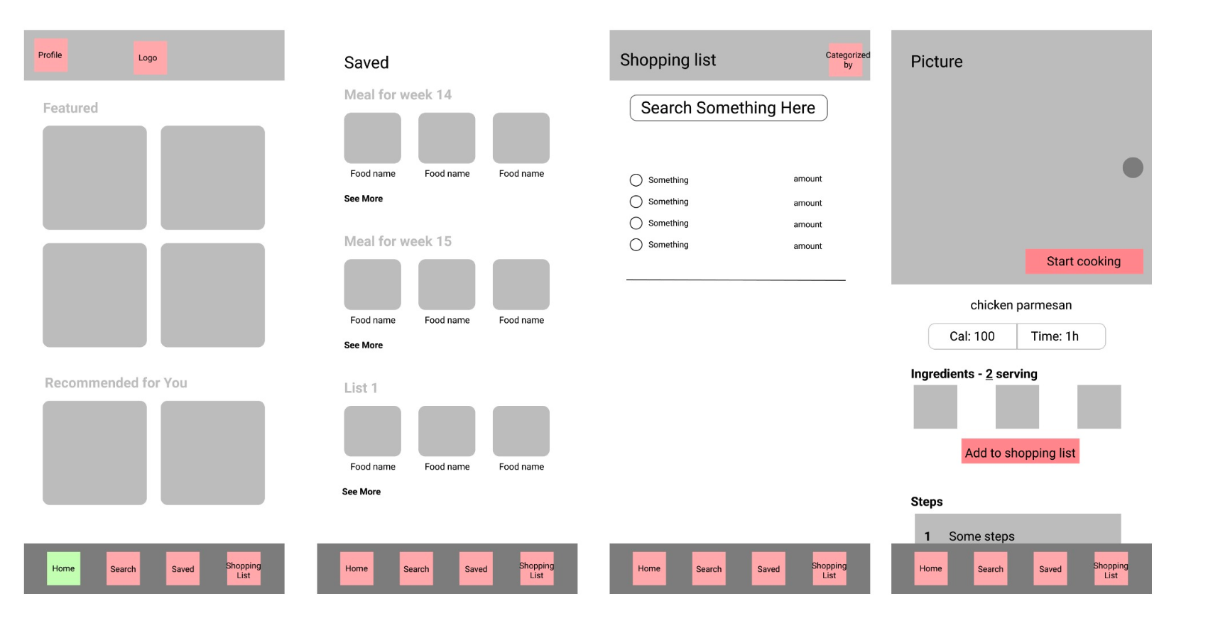
Idea One
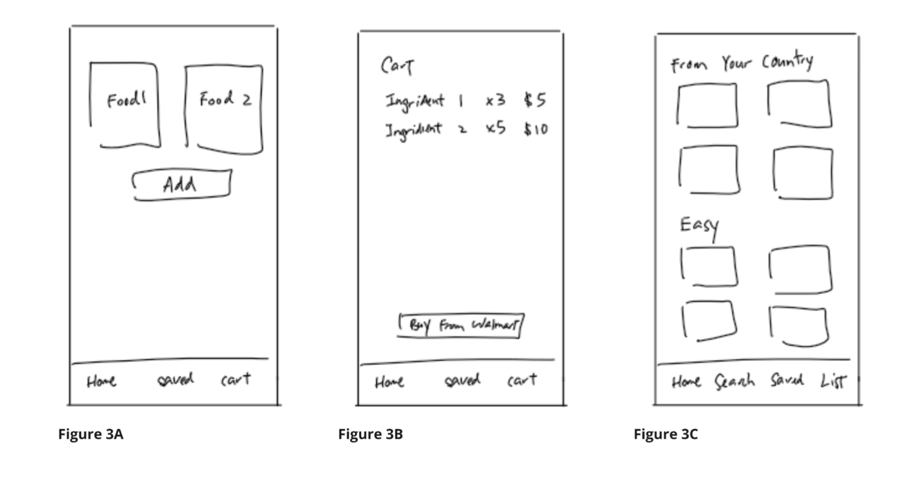
The application will prompt the user to select food they want to cook for the week, and the food that the user choose will be shown at the main page (Figure 3A). After the user select the foods for the week, the ingredients required will be automatically added to the cart. In the cart (Figure 3B), the user can then review the ingredients and purchase them directly through third party vendors like Walmart. The home screen will also allow the user to explore the foods ingredients (Figure 3C).
Idea Two
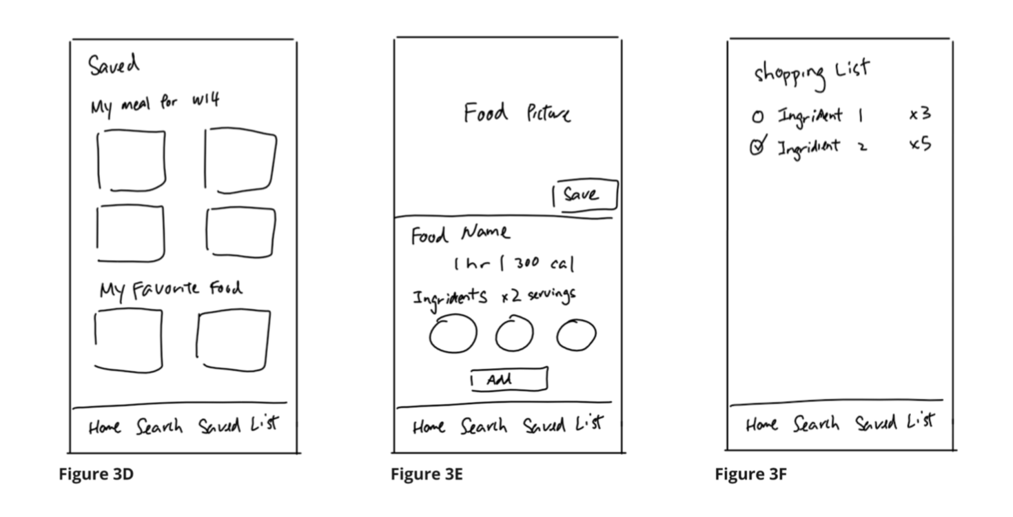
Users can add these recipes to a customized list to create a meal plan (Figure 3D). On the food details screen (Figure 3E), the user can add the ingredients they want to the shopping list, and the amount will be based on serving size the user selected. On the shopping list (Figure 3F), it serves as a checking list that ensures the user would remember to purchase the ingredients they need for the week, at the right amount.
Idea Three
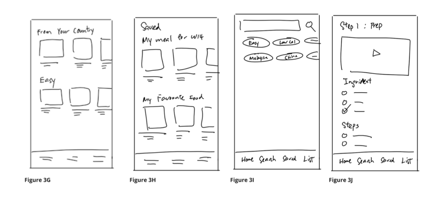
A stepwise recipe screen (Figure 3J) to guide the users on how to cook the specific dish. We found this important because a lot of our participants from our cultural probe tended to forget certain steps or ingredients. To solve this problem, we made the steps and ingredients as checking list, so the user can check the steps off as they go. In addition to that, we also thought of incorporating a video on the top of the screen.
Lo-fi Prototype
After the preliminary sketches we built on the ideation phase, we decided to build the low fidelity prototype of the ideas that we had on Figma.
04
DesignHi-fi Prototype
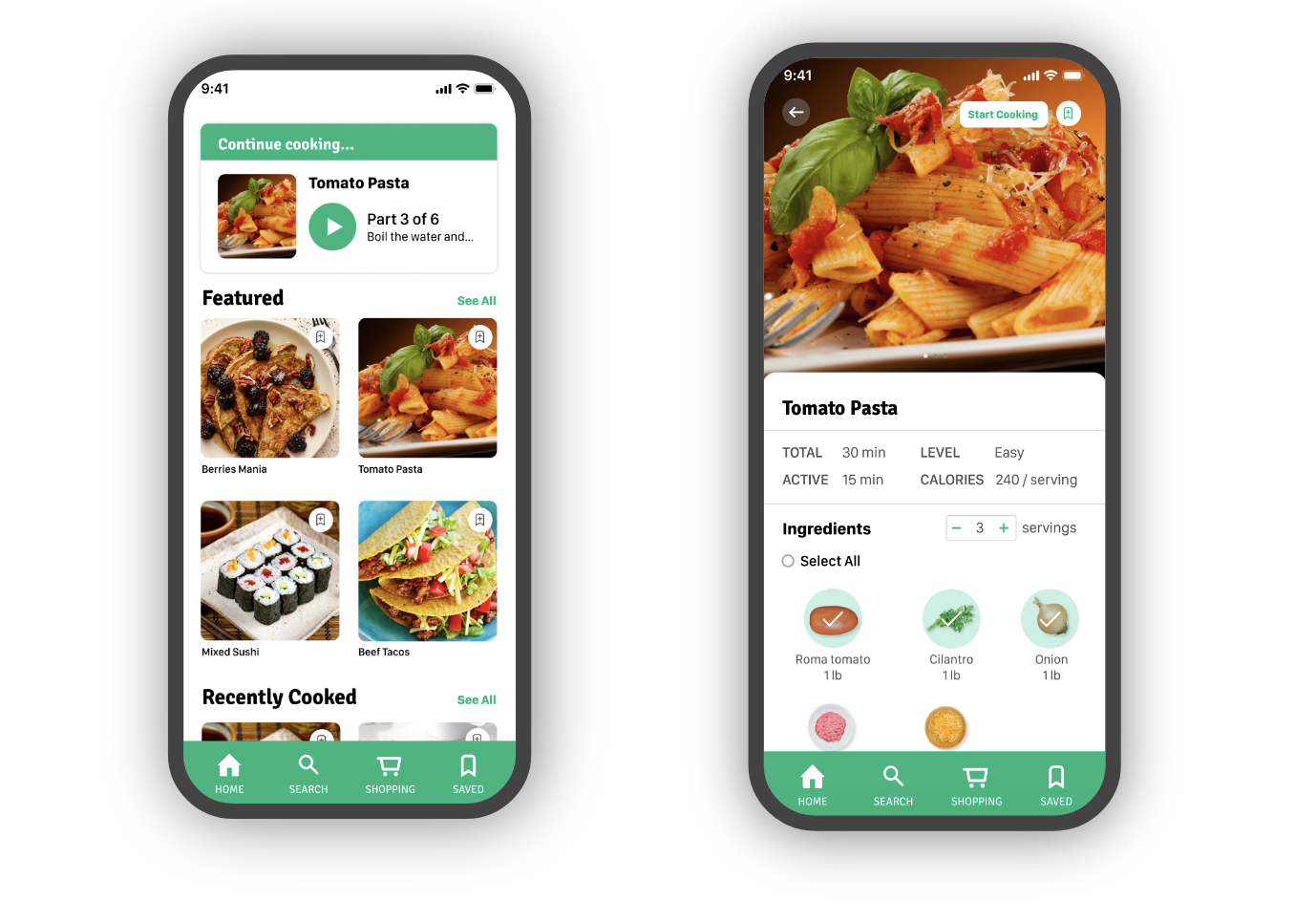
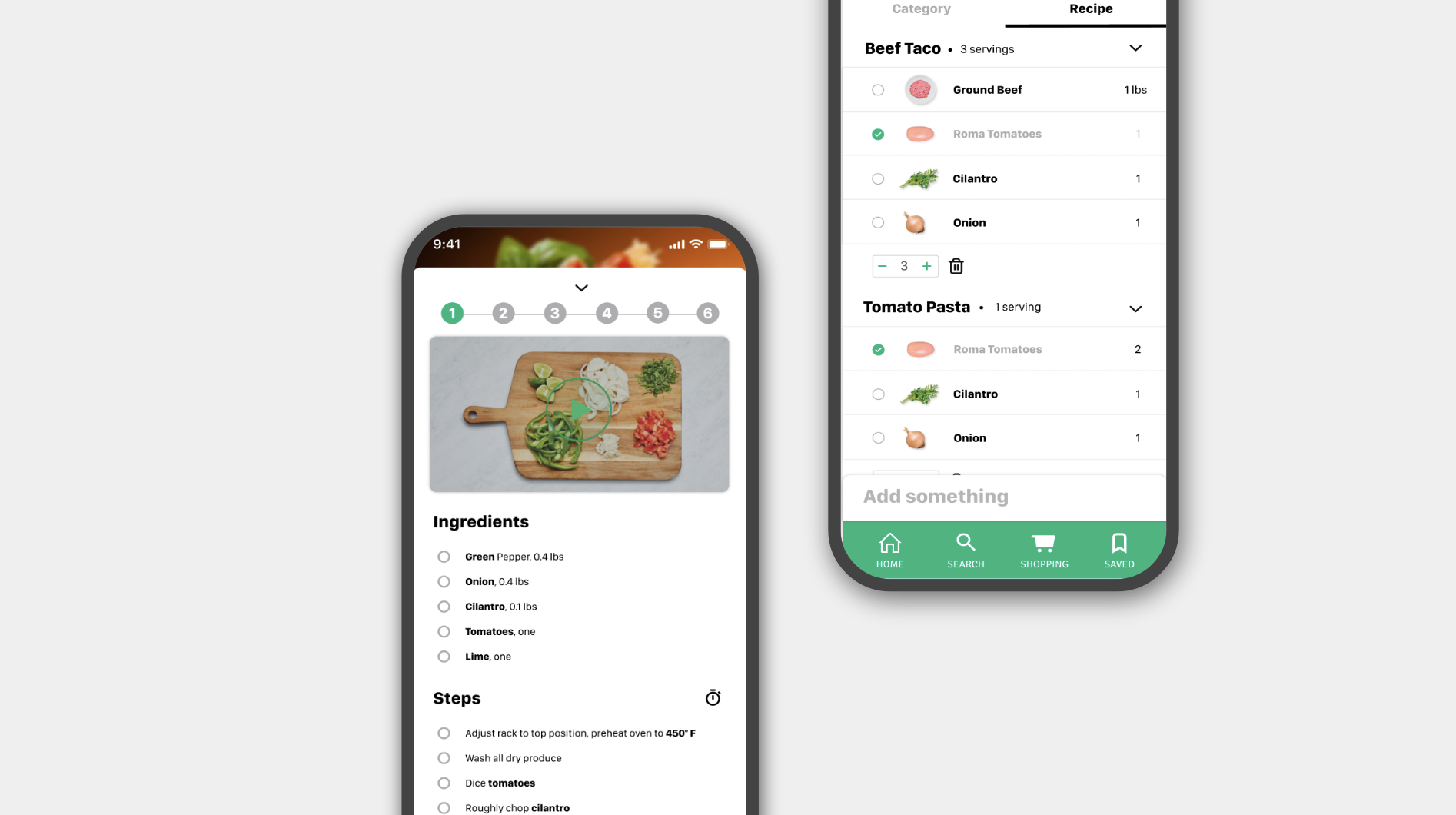
Home page of the application. User are able to explore different kind of foods at this screen, categorized based on their interest and cooking habits. They can tap the button on the top right of the food card to quickly add them to their saved list.
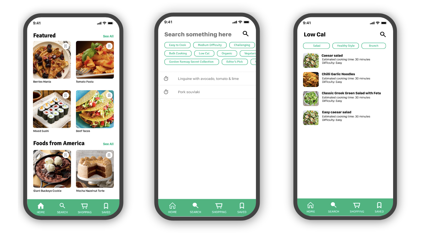
Searching pages. It allows users to search for recipes based on keywords. Millions of recipes could be found in the app.
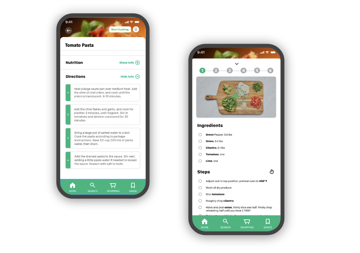
Detailed food pages. It shows important information such as expected cooking time, difficulty of cooking the dish and colories level are provided. The stepwise instructions are displayed after users start the process.
Ingredient pages. When saving a recipe, users can find corresponding ingredients in this page.
05
Testing & Final DesignHueristic Evaluation
We decided to use hueristic evaluation to evaluate the usability our design. This is because users would be mainly on the move or will be multitasking while using the app. Hence, we find it more appropriate to not use user-based testing.
Below shows a sample evaluation file.
Cognitive Walkthrough
Since user-based testing was not performed, we used cognitive walkthrough to evaluate our design as it allows us to be in the shoes of the user. We first define a few common tasks and each action associated with the task and create success or failure story based on our understanding of the persona of our users.
Below shows a sample test file.
Final Prototype Changes
Add sort function by Alphabets or Categories so that users can find recipes more easily.
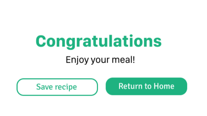
Inform users that they have finished using a recipe and they can either save it for future reference or return back to the main page.
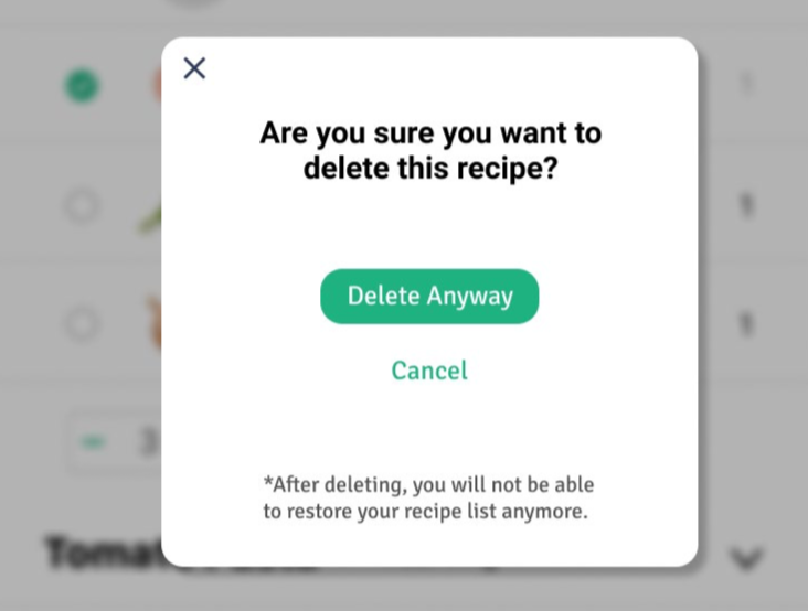
Users can delete the recipe from their list and the pop-up window helps to ensure users whether this is the correct action to take.