Query Communication Website
A website that facilitates the future of collaborative learning
UX Case Study and UI Redesign
Overview
Nowadays, online forums, discussion boards, and any other digital communication platforms, have become very popular, especially during the time of the pandemic. Two particular groups of users who are interested in using these platforms are teachers and students. Students often use these tools to ask questions and exchange ideas with their peers, whereas teachers seek to address students’ questions/concerns and provide maximal support and feedback. In our project, we proposed a new collaborative learning platform - Query for instructors and students who regularly engage in Q&A-type communication online. We utilized Piazza, an educational Q&A communication tool that is widely used by Computer Science courses in the University of Wisconsin-Madison, as a reference application to construct our testing process and create our designs.

01
Define
User Profiles
Students and Instruction teams (e.g., teachers, TAs, peer mentors, etc)
Role
User reseracher, UI designer
Goal
02
ResearchContextual Inquiry
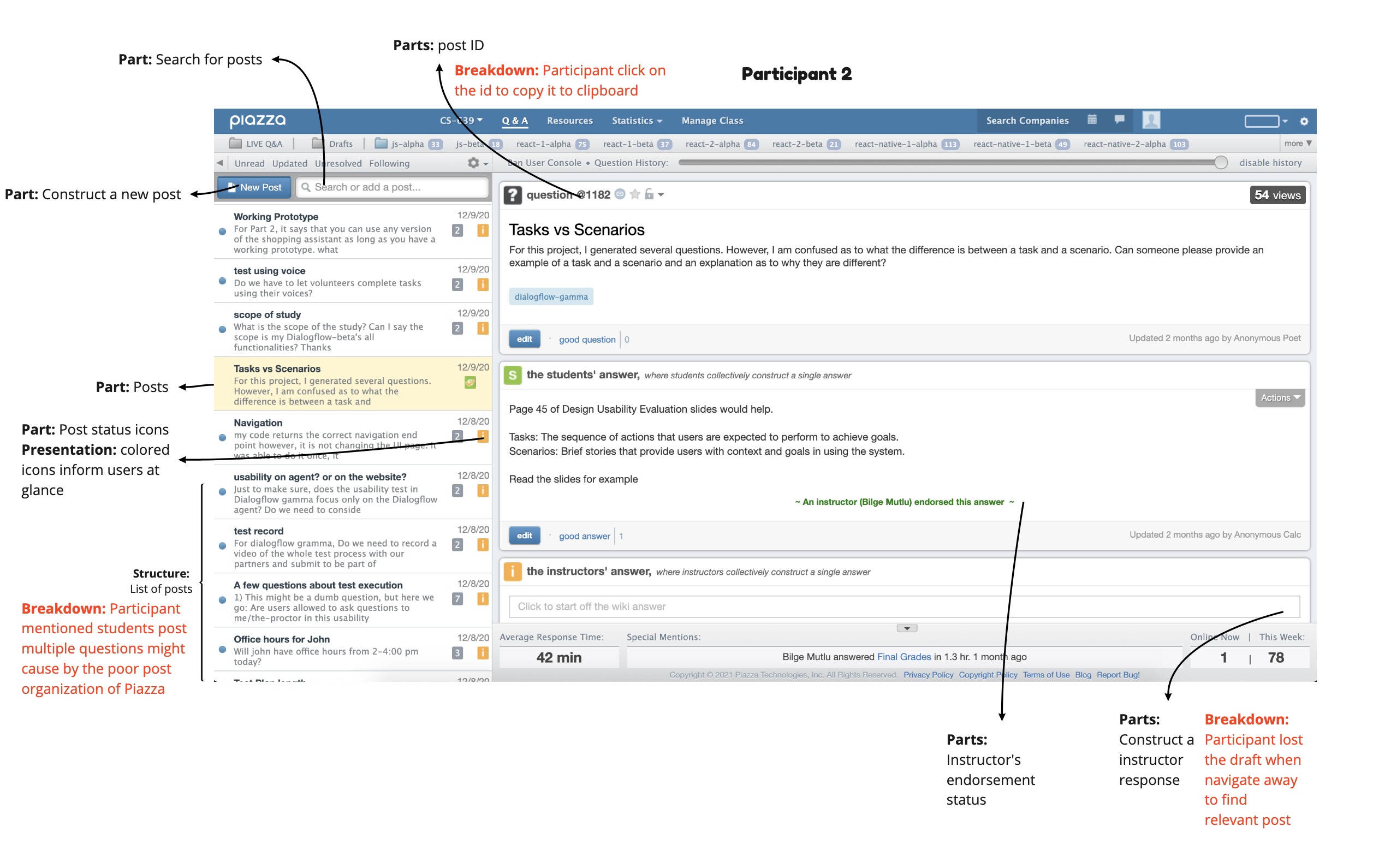
We conducted contextual inquiry session on Piazza with three users, two of which were teaching assistants that utilized the platform to assist students, while the other user was a student who utilized the platform to find answers that she had for the courses she enrolled.
During the interview, we took on the “master-apprentice” model to understand the users in their shoes. We were able to rid our minds of any preconceptions or assumptions about our participants’ contexts, and only ask questions that truly pertained to the participants’ own experiences. Given the circumstances of the pandemic, everything had to be conducted virtually.
Data collection and analysis
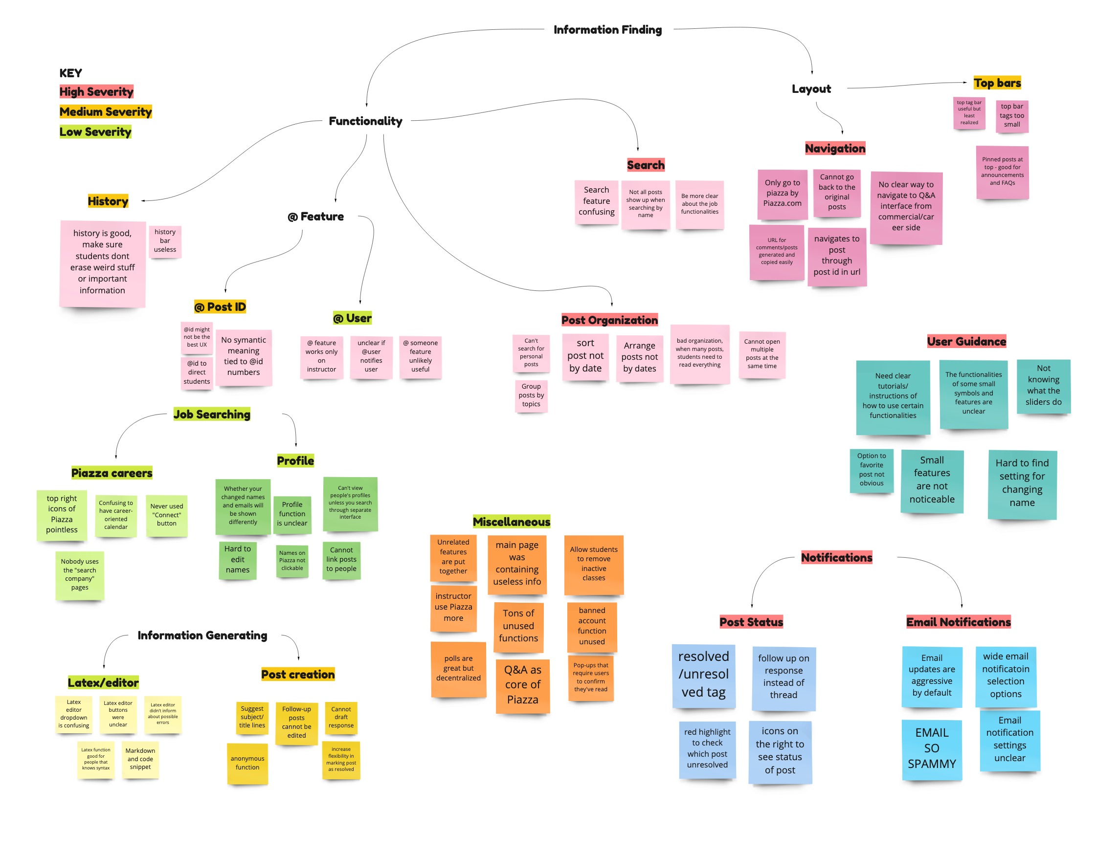
Affinity Diagram
We analyzed our data from contextual inquiry and created affinity diagram using Miro. After clustering the post-it notes, we ranked each category by severity. Red represents categories that caused severe frustrations among the users, while green represents categories that can be addressed if we had extra time.
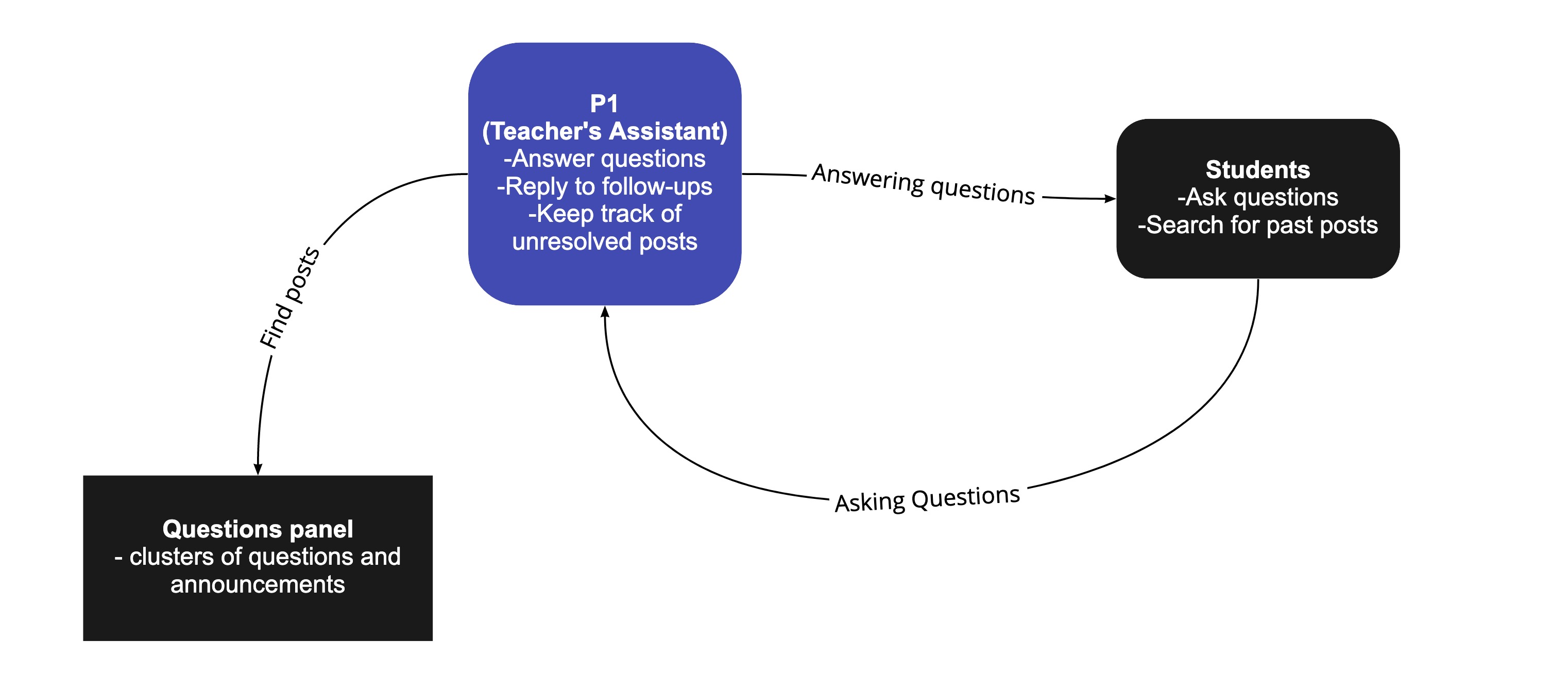
Work Models
We presented work models below that helped us better understand the relationship between different users and the work flows they had when using the piazza.
Flow Model
The flow models allowed us to understand the interaction between users of different role in the system and their main task of using the system. (Below shows a snippet of the model that represents TA's workflow)
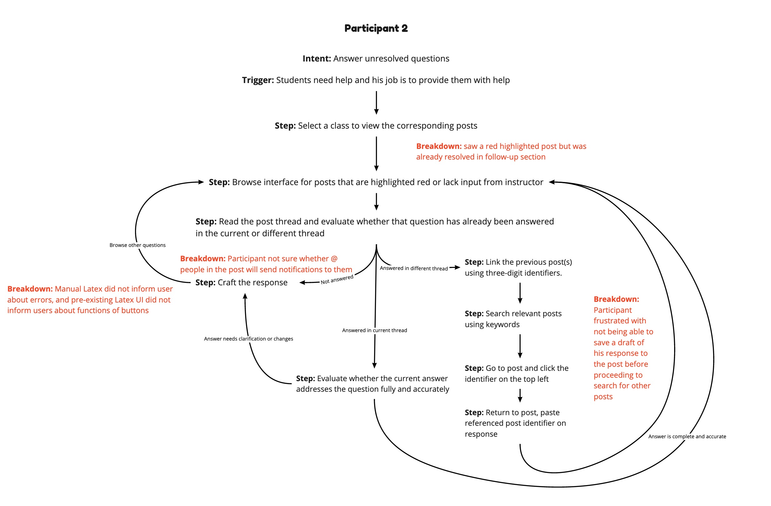
Sequence Model
The sequence models showed the flow of the users' task based on their role in the system, and at which action or screen breakdowns or frustrations happened.
Artifact Model
The artifact model allowed us to identify specific locations on application that caused the breakdown or frustrations.
Key Findings
All the participants shared similar confusions regarding functionalities in Piazza. These findings were very useful as we considered opportunities for improvement beyond the current design.
03
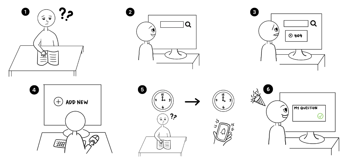
IdeationStory Board
We drew story boards that represented the user action flows.
First, the user got confused about the course concept. Then they went to the platform and tried to search for similar questions but could not found any similar questions. Hence, the user crafted a new post and went back to study while waiting for the responses. When someone responded to the post, they received a notification on their phone. The user returned to the platform, and saw that their problems were finally resolved.
Lo-fi prototypes
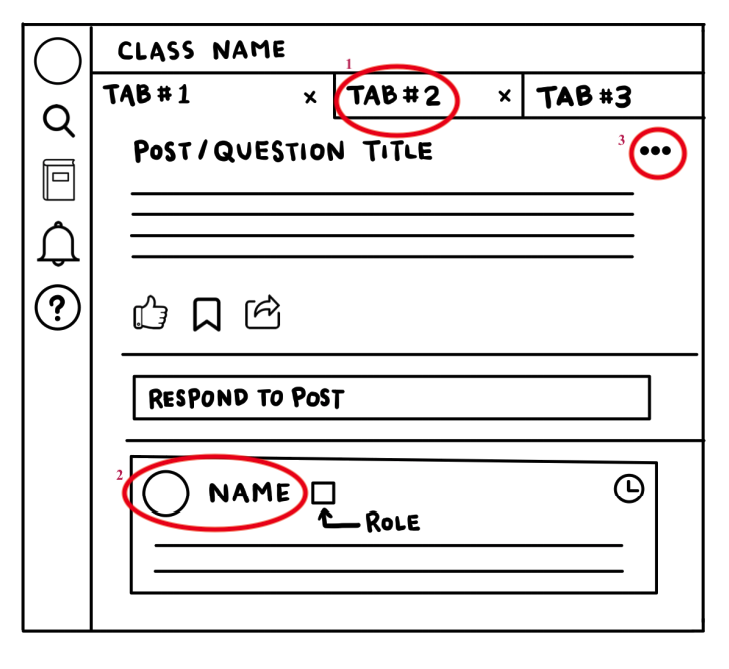
1. Multiple Tabs
Allow multiple tabs to be opened such that user can access multiple posts with minimal interaction cost.
2. Others' profiles
Allow easy access to other users' profiles to facilitate purposes such as teamwork or identifying credentials.
3. Decluttering UI
For economy of space, condense less-used features in a meatballs menu and centralize important post features in one place with informative icons.
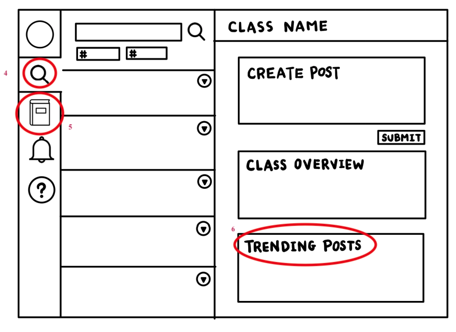
4. Universal Search
Depending on context, the search feature allows users to search for questions in all active classes, or within a specified class
5. Active Classes
Ease of switch between different classes on a centralized control panel
6. Suggestions
Prompt users with keywords and posts that are most recently and commonly searched for
04
DesignHi-fi prototypes
After the preliminary sketches, we moved on to designing our prototype on Figma. Below we presented four example interfaces from Query website.
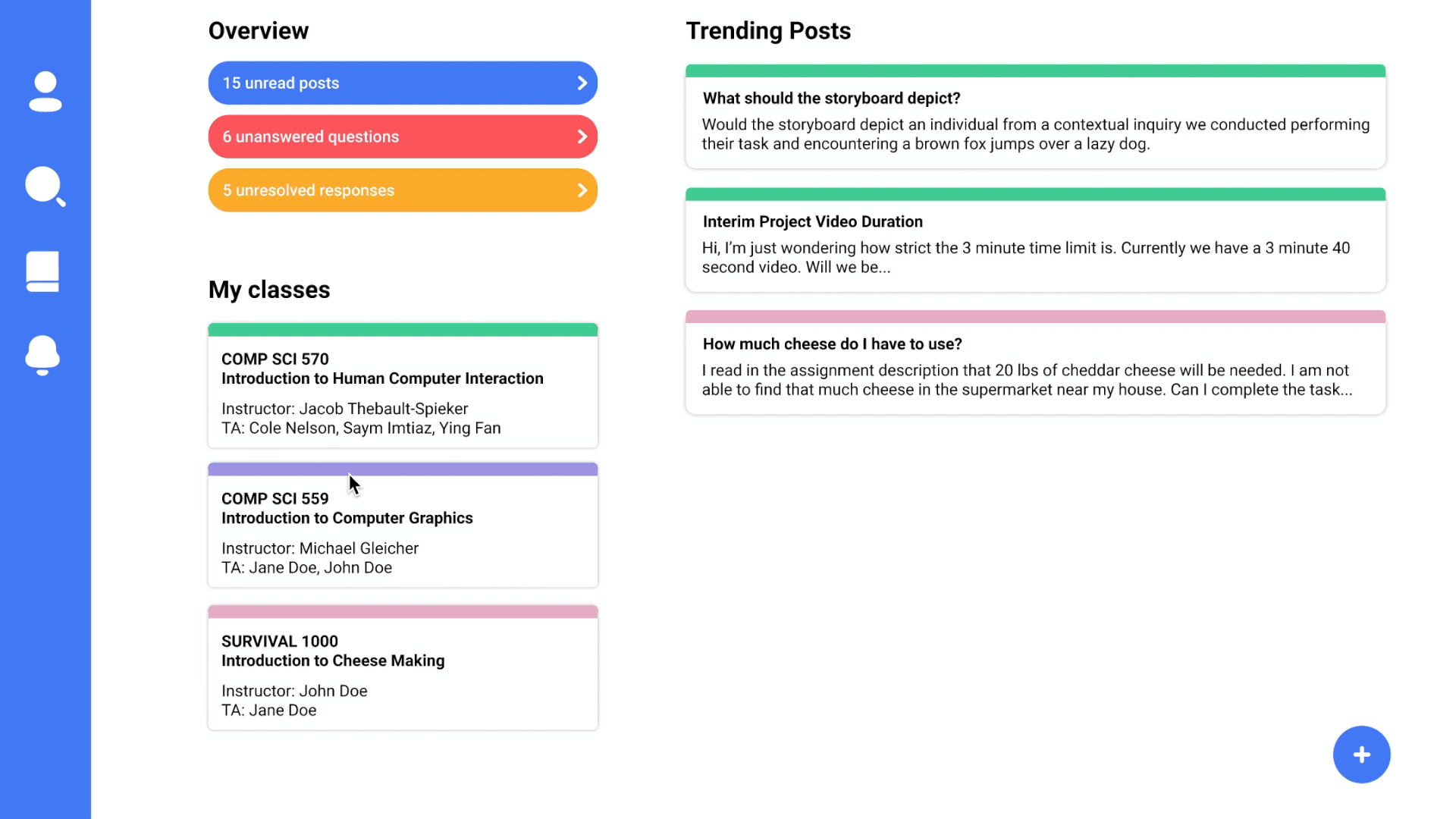
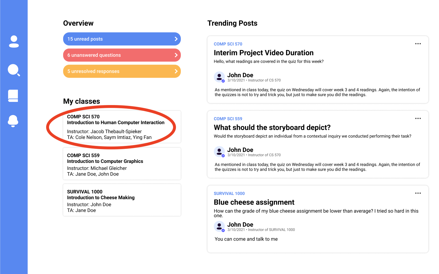
Main Page
Fig 1 shows the main page of our platform. It allows user to track important information – unread posts, unanswered questions, and unresolved responses – in a glance. The user could also quickly look at some trending posts on the classes that they enrolled in, color coded with the same color on the classes that are shown on the left. The classes on the left allows user to quickly navigate to a certain class directly on the main page. Finally, it also shows some trending posts that the user might not want to miss out on.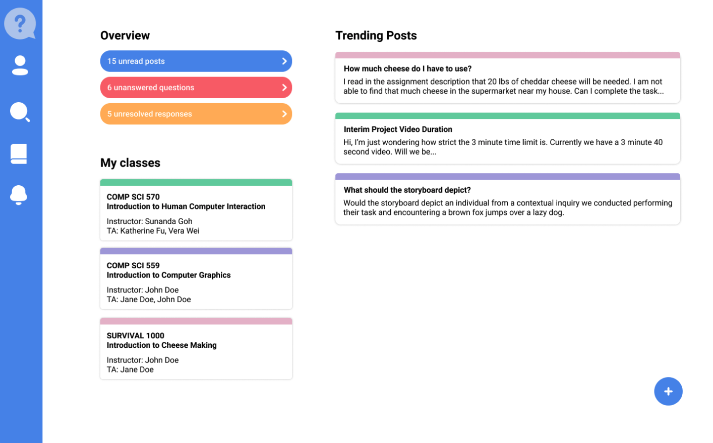
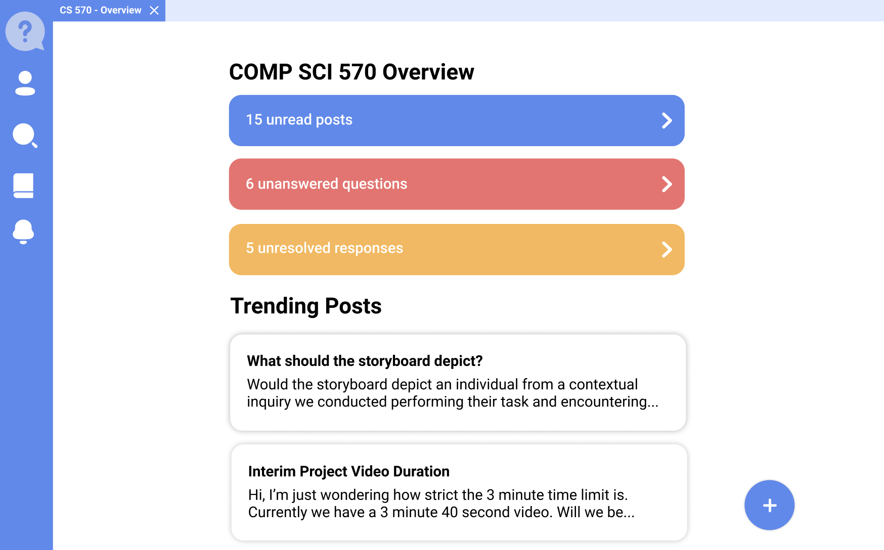
Class Page
In contrast of the main overview, the class overview (Fig 2) shows similar content without all the other class information. This creates a unified experience for the user. The header is updated to the class the user is currently at so that the user will not get confused. In addition, the original "jobs" feature from Piazza is completely removed from our implementation. Instead, we replace the jobs feature with trending post of the current class. These changes are consistent with the home screen.
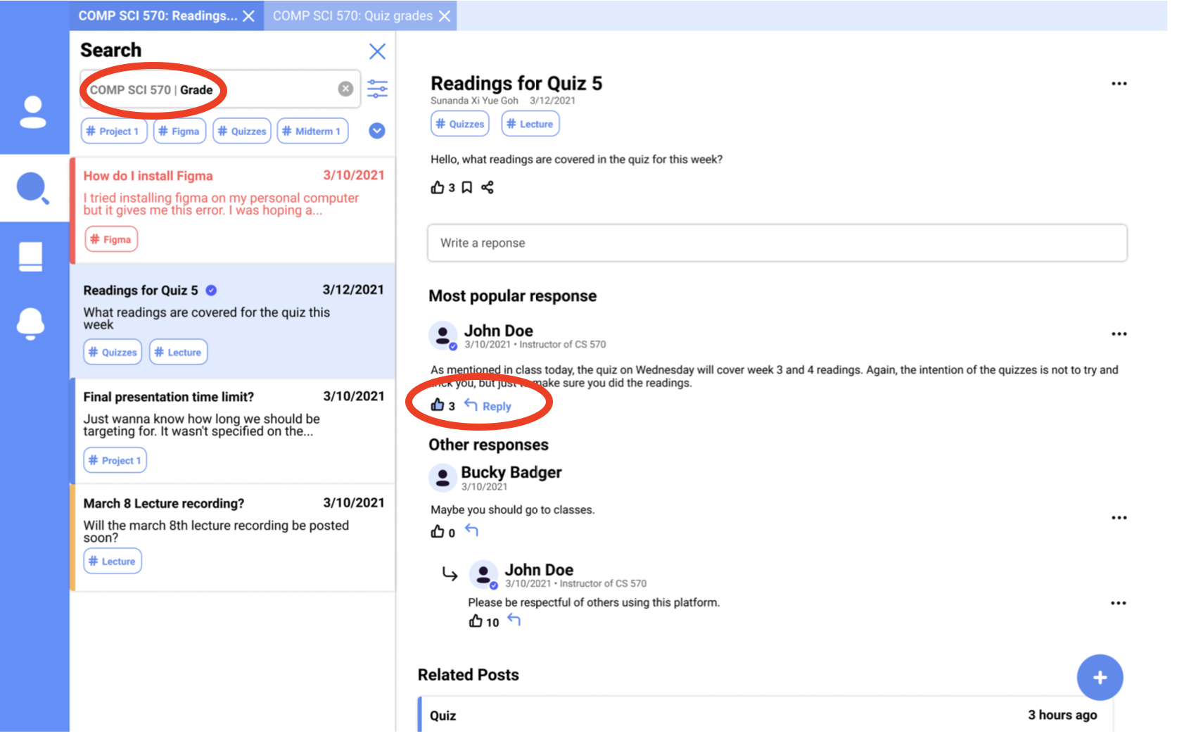
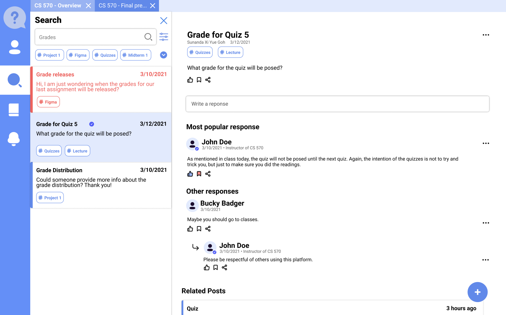
Post Page
Fig 3 shows the tab feature, which allows user to open multiple posts without having to create a new tab on the browser. This in-app tab feature will allow user to better organize the content they are having on their browser.
The left bar displays the posts in the current class. Users can use the search bar to search for a post or filter through tags and key names. The post with Red color means it has not been answered and the one with blue background is the current post users are reviewing.
The post section shows the current post, tags, popular responses and also allows users to add responses, save posts or share them to others.
Related posts are also provided at the bottom of the post if students were still confused about the course topics and would like to explore similar post.
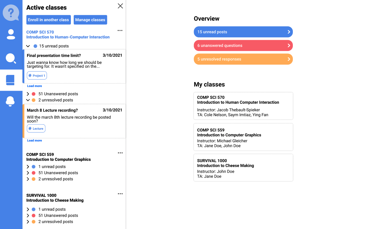
Class Sidebar Page
Previously, the user has to select a class before they can see any further information about the class. We created a class sidebar (Fig 4) accessible from the left bar that provides a more in-depth overview of each classes. The user has quick and easy access to unread/unanswered/unresolved posts whereever they are.
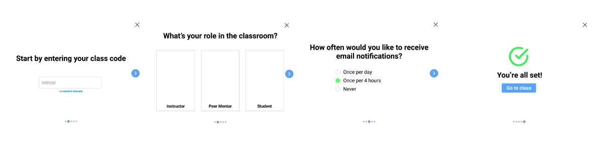
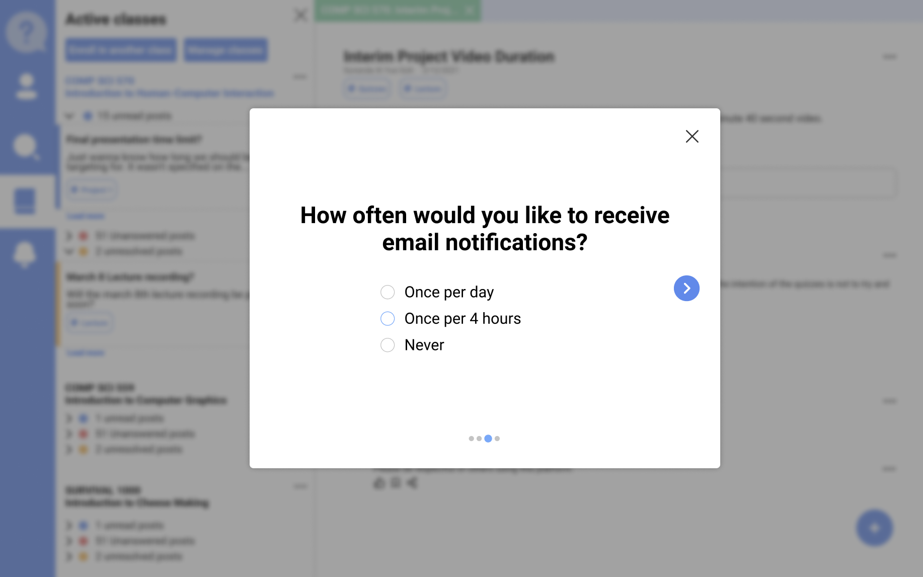
Setting Customization Page
One of the common feedbacks we received during the contextual inquiry process is that users felt that the email notifications are aggressive and did not know how to change that. To fix this, we implemented a cleaner class sign up interface (Fig 5), that allows user to fine tune all important settings of a class directly, instead of having to change it in a later period.
05
Usability Testing & Final DesignWe performed the usabillity test with three participants with three different scenarios of varying difficulty using the hi-fi Figma interactive prototypes. For each scenario, we measured:
We then used the SUS Usability Metrics to measure the usability of our design solution.
We created the prototyping walkthroughs (refer to the Gif) used in our usability testing.
Usability Test Results
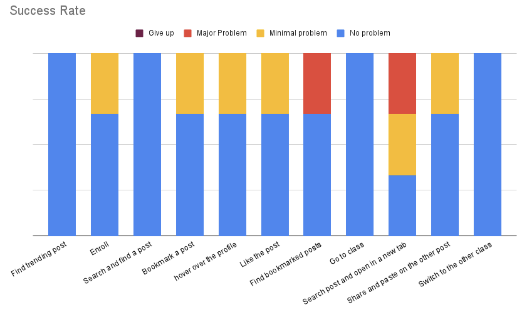
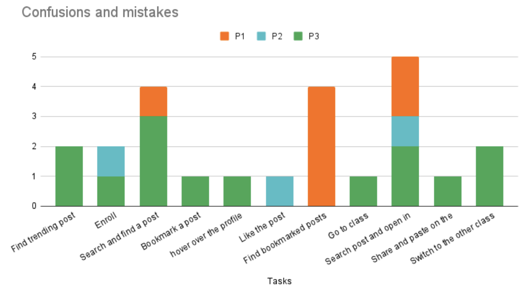
The graph "Success Rate" shows the success rate of each task. The 4 categories in task success rate are – No problem, minimal problem, major problem, and give up. However, none of our participants gave up on any of the tasks, hence such category was not visible on the graph above.
The graph "Confusion and mistakes" shows the number of errors or confusion expressed by the participants for each task.
The average SUS Usability Score we collected is 79, which is a higher than average score.
At a higher level, it seems that the success rate of tasks for the design solution is high, but with some confusions. This might be caused by the fact that the users were interacting with an application they were not familiar with. Further tests with learnability metrics have to be conducted before that assumption could be made. In particular, the tasks - searching posts and opening in a new tab, searching and finding a post, and finding bookmarked posts - have the highest confusion rate and lowest success rate.
Final Prototype
We found that the original main page was too overwhelming to look at as there were multiple different colors. We removed colors for class cards, and used traditional text. We also included popular response on trending post to provide more infomation at a glance.
We added clarification to the search bar by explicitly labeling the scope of the search. For example, if users were searching within a specific class rather than across all their classes, then the title of that class would be shown before the user’s input area.
Furthermore, we removed the options of bookmarking or sharing individual responses and only preserved these options for the root post.